Getting Started
Nexosis Concepts
Forecasting
Anomaly Detection
Security
Troubleshooting
Analyzing Regression Results
Analyzing Regression Results
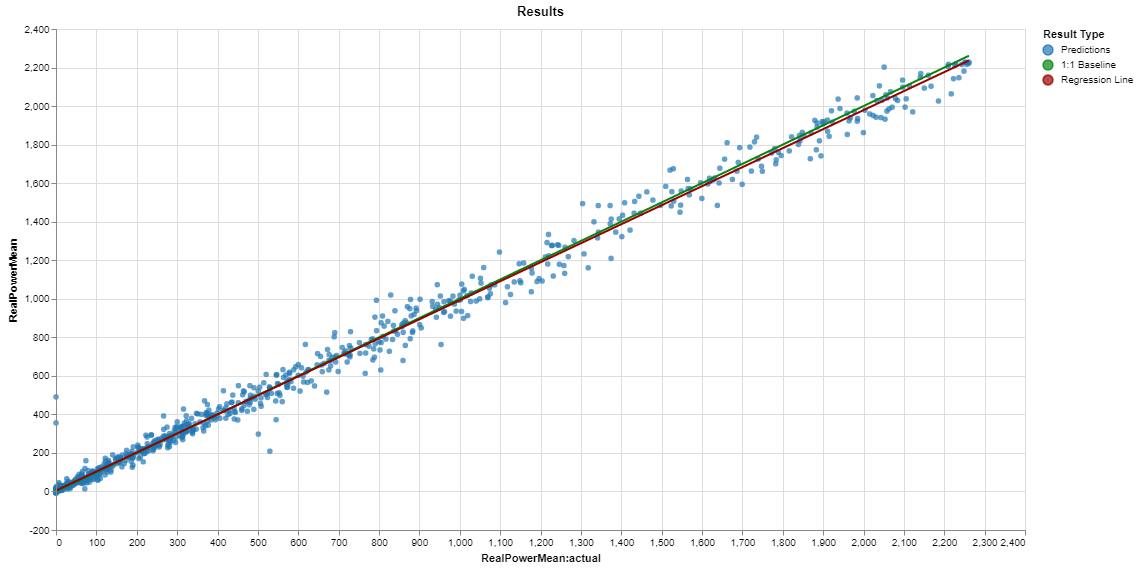
The regression plot shows the predicted versus actual target values for the test set along with a 1:1 baseline and a best fit linear regression line for the results. For a perfect model every point would lie on the 1:1 baseline. For a good model the regression line will be closely aligned with the 1:1 baseline and the data points will be tightly clustered about the lines like this plot:

This model is able to accurately predict the power output of a wind turbine, capturing both the average trend and predicting individual data points with a relatively small error with the exception of a handful of outliers with 0 power and near 500. The typical spread in the data points around the 1:1 line is related to the Mean Absolute Error of 27 and Root Mean Squared Error of 49 reported in the metrics for this model.
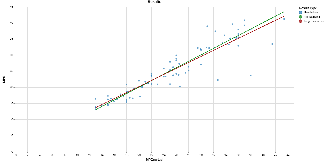
If the regression line and 1:1 line are aligned but the points are scattered that means the model is capturing the average behavior correctly but there is still some unexplained variability or outliers in the data set like this plot:

This model captures the average behavior of the MPG of a set of vehicles but the relative spread in the data is larger than for the wind turbine model and there are several significant outliers in the higher MPG range.
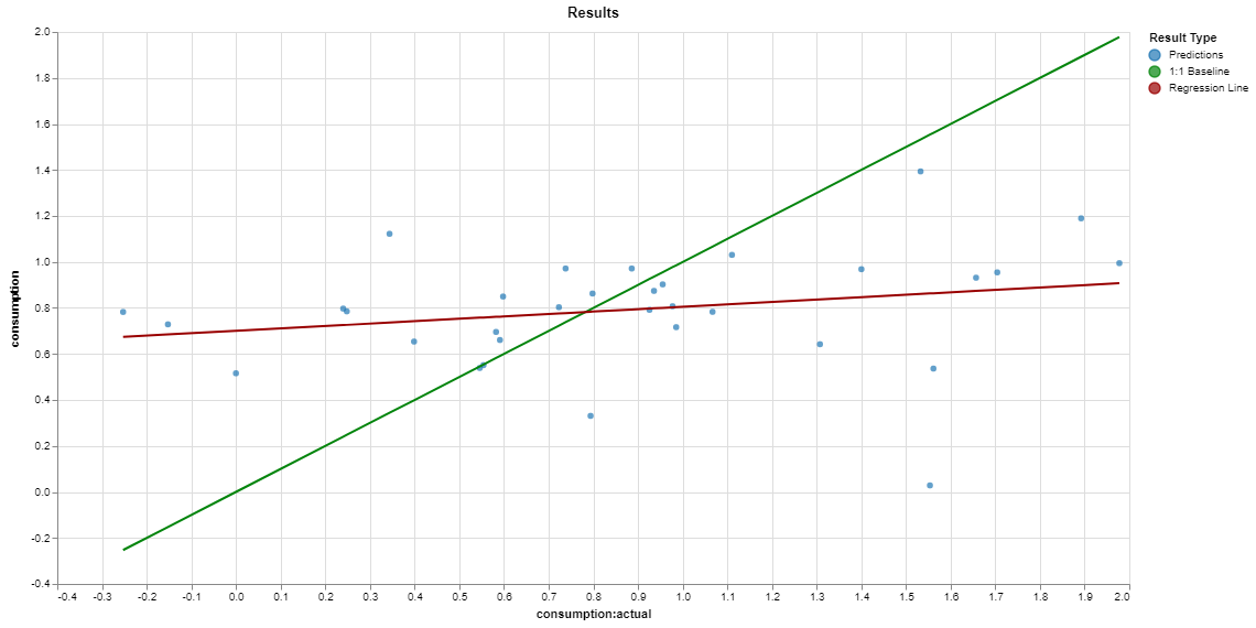
If the regression line is not aligned with the 1:1 line then the model is not even capturing the average behavior faithfully. This plot is an example of a poor model:

This model attempts to predict the change in US consumption but utterly fails to capture the behavior. There is essentially no relationship between the actual and predicted consumption values.
